1992 Super Sonic Fighters Road Pig

While, the 1990s segment of the G.I. Joe line is not really maligned the same way it was in say, the 2000s, and the colouring choices are viewed with a little more appreciation, that doesn’t mean that every figure released in the 90s was a well coloured figure, and excellent. Some figures are just ugly. The Super Sonic Fighters Road Pig is a perfect example of that.

The first series of Sonic Fighters were simple repaints that were all in pretty stellar colour schemes. Sure Dodger was a little dodgy, and the Lampreys was bright, but Dodger’s mold doesn’t really lend itself to any colour scheme other than the original, and for the Lampreys, Orange had become a fairly ostentatious villain colour, the year prior. Still, we were also graced with a Law, a Dial Tone that were neck and neck with the original, and a Tunnel Rat that’s at worst the second best usage of the mold. The next year, when the Sonic Fighters had graduated to being Super Sonic Fighters, it wasn’t just comprised of repaints, and of the three returning molds, we got a tremendous Falcon, a Rock ‘N Roll that has it’s pluses and minuses, and then we get Road Pig.

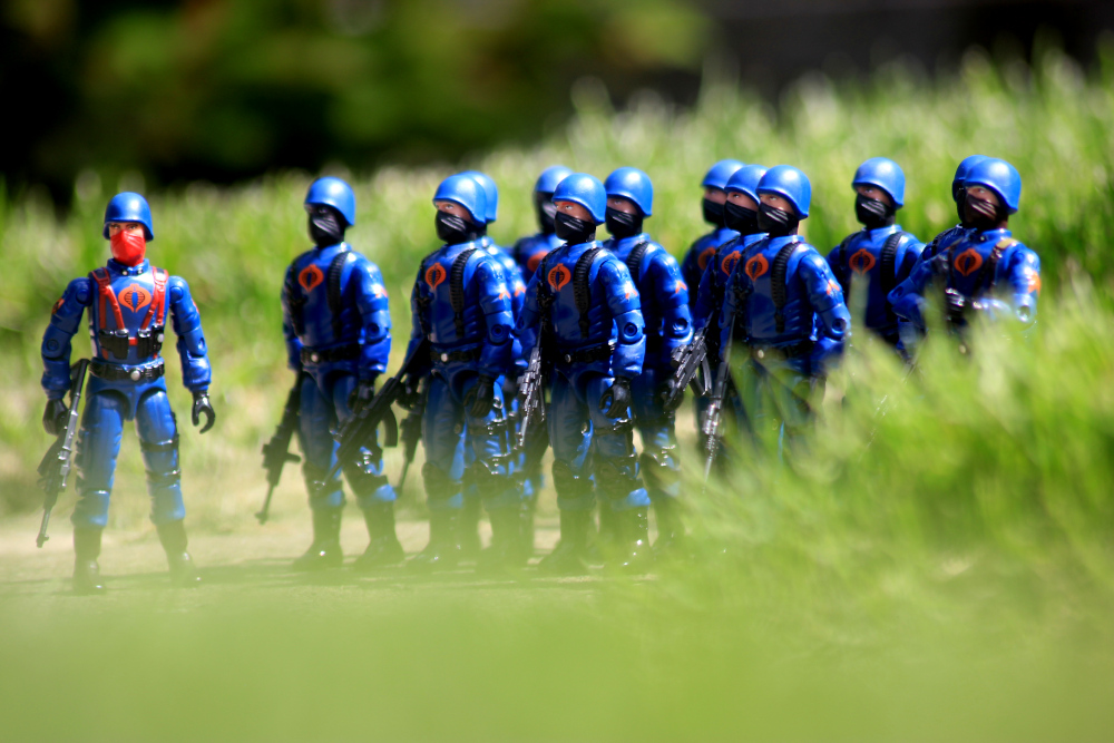
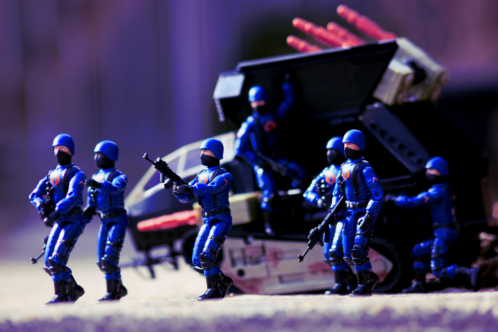
The Dreadnoks were a concept that got dragged out longer than they really needed to be, as most of the late era Dreadnoks don’t really fit the biker motif, and could’ve been just named COBRA operatives, and been just as popular as they were, hell Gnawgahyde probably would’ve become a more prestigious character without the Dreadnok label dragging him down. The only figure released as a Dreadnok that worked in that capacity was Road Pig, who really leaned into the Mad Max motif that the Dreadnoks flirted with, when Thrasher was released. This, in addition to the overbearing presence in the comic book in the late 80s, helped make Road Pig among the few post ’87 figures with any online presence in the early fandom, though a lot of it was contained into the part of the fanbase that were vocal Dreadnoks fans.

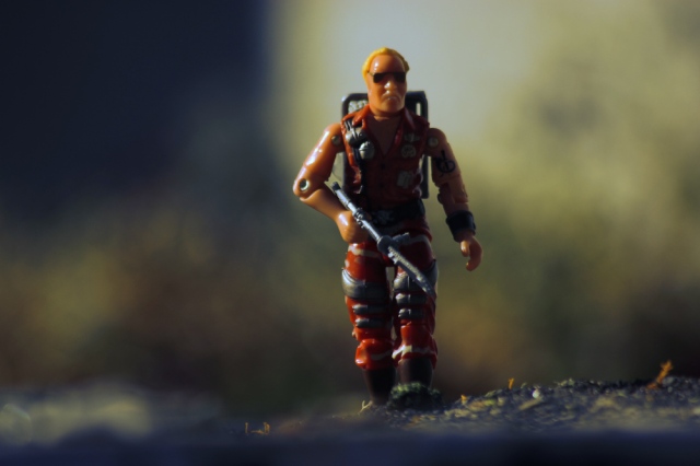
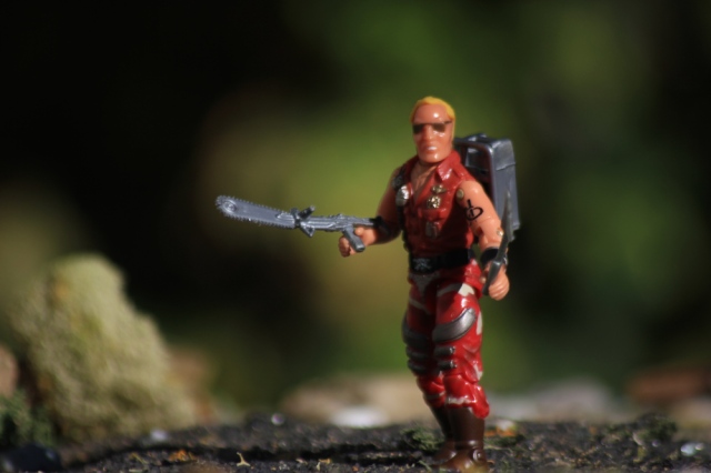
The sculpting on the Road Pig figure is one where there’s nothing you can criticize. He fits the figure’s role exceptionally well, as a hulking monster with a criminal disposition. The sculpting is well done, from the large muscles, and scaled up appearance, where even his legs are bulkier than the traditional G.I. Joe figure. Where some of the complaints could be levied, like the single glove, is easily explained away by the wrist mounted crossbow and armour, as is his shirtless-ness. While the design might be a little outlandish for some people’s tastes, he’s still less outlandish than Croc Master, or Raptor.

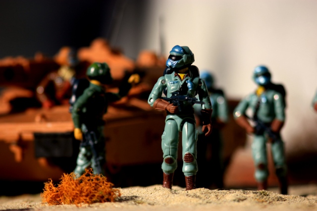
One of the biggest problems with the late 80s take on G.I. Joe, is the amount of sameness in the designs. In 1983 and 1984 you had two figures with bare arms, Gung Ho and Roadblock. Both figures were on the surface sharing a similar design, but there’s a lot of differences between the two, that you don’t really think about that fact. In 1987 and 1988, you had Big Boa, Croc Master, Zanzibar, Raptor, Road Pig, Wild Card, Steam Roller and Armadillo all featuring fairly similar designs. The worst part of which, is that these figures are supposed to be placed side by side with some of the most military inspired figures of the whole line, leading to nothing really being as seamlessly interactive as the line had been prior. Honestly a bunch of shirtless guys fighting it out on the Launchpad of Cape Canaveral is pretty much what those two years could be summarized as.

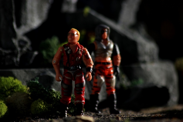
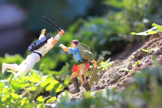
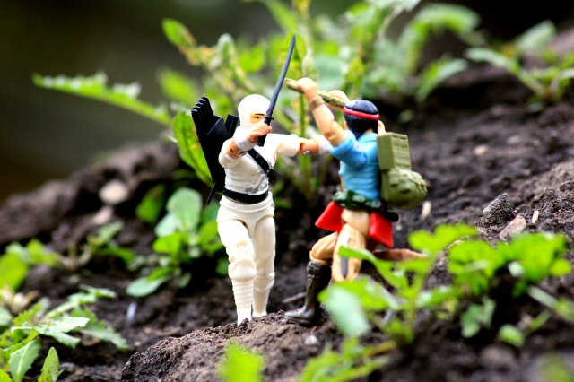
While, the Road Pig figure isn’t something you can criticize too much for the actual sculpt, though your mileage may vary on it’s usefulness, the 1992 Super Sonic Fighters edition is easily criticized about it’s colouring. While the 90s used to be tarred and feathered due to the “neon” aspect of it, very few of the figures were neon for the sake of neon. I don’t even know if I’d even fault this Road Pig for having neon green highlights, because it works well with the dark navy blue the figure is clad in. However, the skin is practically neon orange, which is pretty fucked up, and doesn’t work well, especially with the orange dye job that Road Pig went out and got. If the figure had a remotely human colouring it wouldn’t be so easily dismissed, but it’s frankly the worst skin tone the mold got in the 1990s, and the other two were green and blue. I think the figure might be a case of the accompanying colours making something appear worse than they are, because the colour of the skin used for Dice, Dojo and T’jbang is similar, but I think this is a little more orange than those guys. Sometimes people will use this figure’s torso for a Dice custom, that looks pretty gnarly, but I don’t have extras of either to do so, so c’est la vie.

I don’t use the Road Pig character, in the traditional sense, of being a Dreadnok or Zarana’s bodyguard. To me, he’s just a paid COBRA assassin, used in some tit for tat game of death, where the Joes and COBRAs use low level assassins to prick at the other, without letting anything get too far out of hand, or anyone of any real use or value being liquidated. It’s a fun little side aspect of things that, allows figures I wouldn’t use all that frequently, to be used against each other, without any real consequences or whatever.

The whole “low level killers going after each other” is one of those things that helps explain away a lot, in how I view the G.I. Joe and COBRA conflict. A lot of the COBRA vehicles after COBRA Island comes into existence are defensive in nature, and I’d imagine that COBRA Island would be swamped with Adders, and anyone with a halfway decent air defence network would be a no-go for any form of aerial based assault. So the G.I. Joe and COBRA conflict, really degrades into a low level thing, where it’s mainly bluster and weird shirtless psychopaths killing each other. COBRA falls apart due to incompetent leadership, as you have a guy dressed up as a reptile as the minister of defence and by the end it’s an Island full of feuding warlords with increasingly goofy titles, like Dictator, fighting amongst each other with whatever remnants of COBRA’s standing army that they can get to follow them.

While, I like Road Pig in the role I’ve assigned to the figure, I can’t say that this version of Road Pig gets too much use. The figure’s skin is just too out there for me to be willing to use, it’s a shade of orange you only see on Hulk Hogan and maybe a leathery trophy wife with a name like “Bunny”.

Road Pig’s a mold that got more use than one would expect, in addition to the four times it was used as Road Pig (’88, ’91, Funskool, and the Convention Set), there were also two uses as Blanka from Street Fighter II. The torso also had a few other uses, so it’s been done up in all the ways it probably could be done up, with some room to make customs if you feel that at some point Road Pig would want to invert the colour of his pants and belt.

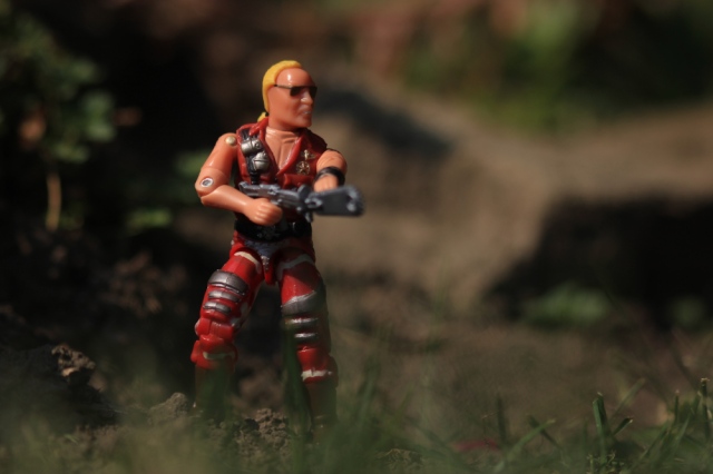
Upon using the figure in photographs, it’s grown on me. I didn’t really like the figure for a long time, and avoided it for years, until I got a Funskool version amongst a few other Funskool figures, as cheaply in 2020 as it would’ve been in 2002. Using figures is a really good way to determine their worth, especially in a line as vast as G.I. Joe where it’s got about twenty to thirty major characters, and then about three hundred C listers, who can be overlooked. Gung Ho appeals to pretty much everybody, Hardball doesn’t, but both are fun figures, with strong uses.

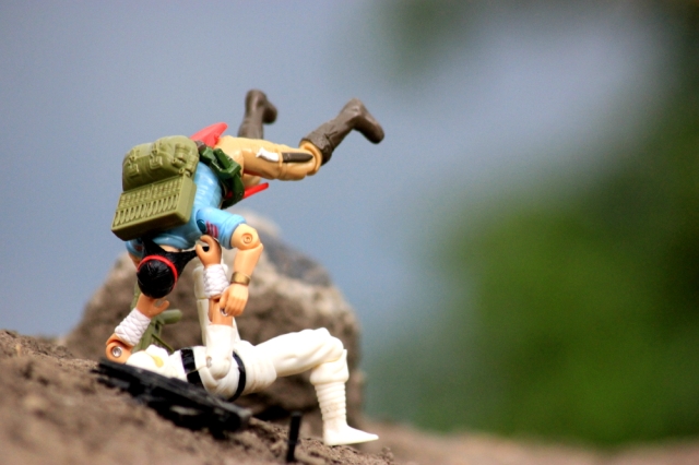
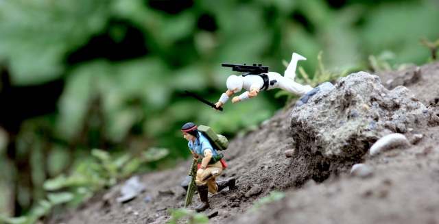
Still, this version of Road Pig, doesn’t get much time from me, I’ve tried, but nothing about the figure really does much for me. He doesn’t really match up with many other figures, as anyone with colours that mesh with him, aren’t really contemporaries from a mold or design point of view, which impacts a figure like Road Pig more so than others, as his design is really a product of where the G.I. Joe line was at the time. On the flipside, the figure’s colours prevent him from really working with the mold’s contemporaries, and he sticks out like a sore thumb, in a bad way. I find that the Road Pig figure’s best match up in the entire line is 1987’s Jinx, and sadly, there isn’t a Jinx figure that works well with this version of Road Pig. Though, that could change with the rumoured potential factory customs, I still have some doubts.


Posted in Reviews | Tagged , , , , , , , , | 2 Comments

1983 Amphibious Personnel Carrier (APC)

Scale issues is one of the things that G.I. Joe vehicles have always been encumbered by, as unlike many other toylines where problems with scale were easily written off with the fact that most of these things didn’t exist, G.I. Joe was using stuff that was relatively based in reality, and people are pretty clearly able to tell, that, no, the M.O.B.A.T. really doesn’t look to be the correct size when placed beside a figure. A lot of the time, these scale issues are only brought up, when someone is trying to dunk on a thing they dislike, like the M.O.B.A.T. which is highly unpopular, or at least was at one point, mainly because the tank really didn’t interact with figures all that well. If a vehicle was fun, but was wildly out of scale, nobody would really bat an eye.

On the flip side, the scale argument can’t be used when something is probably closer to being in scale than most vehicles, but also isn’t very fun, because the hypocrisy is so easily pointed out. Perhaps the most in-scale vehicle, that also isn’t very fun is the 1983 Amphibious Personnel Carrier. It’s not that it’s a bad vehicle, or toy, it just doesn’t really have the oomph that a V.A.M.P. or HISS or Tomahawk had.

The first year of G.I. Joe releases, was relatively modest, in comparison to where the line was heading, and with the fact that the entirety of that line up was going to be re-released with Swivel Arm Battle Grip, the 1983 figure line up, while solid is relatively small when it comes to new single carded releases. Vehicles, however were a different story, with a surprisingly large number of them being released, even though most were small like the PAC/RATs or the SNAKE armor.

The APC is something with a lot of aesthetic appeal, and really comes across as what it’s supposed to be. It’s big, it holds a lot of figures, and has nice angular armour, nice dark olive colouring, a cannon and that’s about it. With the “canvas” top removed, you can see the figures sitting down, there’s really not all that much you can do with the vehicle other than use it as a bus for your figures. It’s fun for a little bit, but it’s really one dimensional, where I think placing the figures in the back is the most fun you can actually have with the thing. Perhaps that’s why, 40 odd years later, high quality samples of the APC are still easily found.

There are two big gimmicks for the APC are that it doubles as a carrying case and the fact that it floats. The opening in the back of the APC has seating for 16 figures, plus two in the drivers cabin. That’s 18 figures, plus foot pegs in the centre aisleway to hold an additional 10 figures, which is actually pretty impressive. The detailing in this area is a lot better than it really needed to be, the seats are a tad shallow, but they get the job done. The flooring is done with a diamond plate pattern that helps maintain the military vehicle visage. For a form of playability, the seats feature a removable seatbelt that stretches the length of the back. The drivers cabin is actually a really well done section, despite the fact it’s not going to be looked at all that much, with a lot of room for the figures, and a highly detailed dashboard. The steering wheel is quite well done, and removable, for some reason, as it’s a static detail.

By floating, it gives the vehicle the “Amphibious” name, while I’m sure it’s probably a fun little gimmick for the vehicle, I’ve never tried it out. The APC is too big and cumbersome to drag out to any body of water, and I won’t lie, I have a terrible vision of it being loaded with figures for some stupid reason and it sinking to the bottom of a river or something.

One of the big draws of G.I. Joe vehicles, was the included driver. They were unique from the common carded figure, and no matter if the figure wasn’t really all that good, it would have a little bit of cachet just based on being released with a vehicle. The APC didn’t include one, which has always been somewhat odd to me. It was the first full sized vehicle to not have one, and remained that way for years (store exclusives excluded). Perhaps the lack of included driver hurt some of the APC’s perceived value.

Looking back, I think the APC being a multi-purposed probably prevented the inclusion of a driver. Play sets rarely did, and in some ways the APC is just as much a play set, as it is a vehicle. The big selling point on the back of the vehicle was the fact you can use the thing as a carrying case for your whole collection. The photo on the back, is a little less “professional” than what Hasbro usually did, as there’s multiple Flash, Rock ‘N Roll and Grunt figures in the back of the APC. It stands out, but it also really illustrates what a kid’s collection was going to look like in those days, the multiples of certain figures from birthdays and the like.

While I don’t actually display my collection, the APC would be one of the vehicles that would have a place if I were to. For as big as it is, it looks good, and features the ability to get a lot of figures into a display. Being able to get pretty much everyone from my favourite era into a display would be a thing I’d choose to do, and even if it’s just the figures lining up to get into the APC, it would work for me, and be both something that makes sense and fun enough to look at.

The G.I. Joe line had a continuity to it, which means a first series figure and a twelfth series figure have the same basic construction, but that doesn’t mean that everything is going to work well with each other, the sizes changed over time, the choice of colours or the style of design would change as well. The APC managed to be fairly timeless, both in terms of the style it was sculpted in, and the colouring used. It’s got enough to it that it works just as well with a 1983 Tan Grunt as it does the 1991 Dusty. The fact it was so large a toy, helped as well, as it fits figures from the whole line, which isn’t always easy as some vehicles were outgrown by the figures, like the ASP.

Which is probably why the vehicle got a couple of repaints over the course of the vintage G.I. Joe line. First in the Night Force, and then again as a mail-away known as the “CUDA”, which has a different colour top. Both look good enough, where I’d be willing to pick them up, but they’re also relatively rare and therefore going to cost far more than what I think an APC is actually worth. Which for the record is $20 Canadian dollars.

How I collect is based a lot around what I actually do with my collection, and while I’m generally not a big fan of the vehicles in terms of things I want to own, the fact of the matter is that they work very well in photographs, and since that’s the main focus of my collecting, I had to purchase some vehicles.

There are many vehicles out there, that are far cooler than the APC, but they don’t really feature the ability to interact with figures. A lot of the planes in the G.I. Joe line are better than the APC on pretty much every level, other than the fact that the APC can look good with over a dozen figures, while the Skystriker or the Night Raven or Rattler really tend to max out at three or four figures being able to do anything with them, and you can only do so many “flight prep” photos.

I picked up an APC, because it’s great for many aspects of photos. It photographs well from every angle, which helps a lot when determining how to set up the photo, it has a few ways to change the look of it (top on or off), and there’s enough different ideas it can be worked around (loading up, the Joes getting out of it etc.), and it’s big enough that it can be placed far in the background if needed to cover up something that you don’t want in the photo.

The size of the APC does have it’s negatives, though. I’ve spent the last four or five years, actively trying to rip-off the cover of issue 14 of the Marvel comic. The vehicle being so goddamn big, really impacts the ability to do that easily, because of the perspective of the whole thing. Maybe I’ll actually try harder one day.

Posted in Reviews | Tagged , , , | 6 Comments

2004 COBRA Infantry Forces

In the last decade or so, the reflections upon the repaint era, are generally negative. It makes sense, because, that was an era, where the fanbase was pretty aware of everything going down, had a generally solid knack for identifying what was going to be an issue, and there is some resentment to the fact that the majority of releases after the repaint era, were generally more in line with what the collectors had been asking for (single carded figures, retro style character art, et al.), while when the 2000s era releases were at their hottest, there wasn’t that kind of willingness to throw the collectors a bone.

There was one time Hasbro threw the collectors a bone, and I think we’d still be viewing these figures as amongst the best releases Hasbro ever concocted, had the line died off in 2005 or 2006, and stayed dead. That would be the COBRA Infantry Forces 6-Pack. A release that featured the top figure choice that most collectors had been asking for, for a few years, a Comic Book reference, and a release format that perfectly encapsulated what the G.I. Joe fanbase’s preferences really were, and in fact, still are.

After G.I. Joe’s initial vintage run ended, it had a couple phases of non 3 3/4″ stuff, that was loosely related to A Real American Hero, but after that had faded out, and 3 3/4″ made it’s return, as a line which acknowledged the collector base, and in doing that, the idea of army builders was touched upon, fairly rarely. In 1998, there was a set of Vipers released, and then Hasbro went to releasing retail Army Builders in two packs with characters, in diverse multipacks and as vehicle drivers for the next few years, following up with a novel online B.A.T. 6-pack, that you might not have gotten if you ordered it from The Store On 44.

In 2004, Hasbro finally did a mass release army builder set, which was likely the most popular release with collectors they ever did in the O-Ring format, the COBRA Infantry Forces TRU Exclusive 6 Pack. Never before, and really not ever since, did Hasbro really nail an army builder set, the lack of characters was the biggest positive that could happen. The same basic release scheme was used for the Night Watch set, but it didn’t have the oomph this set had, and didn’t have the same molds as the TRU set, which was a death knell at the time.

At first glance, the figure appears to be a 1982 COBRA Soldier repaint, with Thunder’s arms and a new head. What is often overlooked is the fact that the mold is completely re-done, and in doing so the parts, have been beefed up a little, so that the figure has a better match for the Thunder arms, as well as fitting in better with a lot of the contemporary releases of it’s time. The 2000s were still a time when the swivel head releases from 1982 through 1984 were considered “too scrawny” and “under detailed” by the majority of the fan base, who at the same time had little problem with mixing the random assortment of repainted vintage O-ring molds, and the New Sculpt Figures that were so disparate in design, that a non-collector might have trouble determining if they were even from the same toyline. The biggest tell is just how much more prevalent the few wrinkles sculpted into the torso are on this mold, versus how they are on every other release. In some ways it was beneficial they did this, because they wound up matching the arms from Thunder a lot better.

The molds used in the COBRA Infantry Forces 6-pack are in line with Mutt, Scrap Iron, Storm Shadow, and a handful of other vintage molds that were re made for the purpose of getting classic molds back into collectors hands. This is one of those things that wasn’t discussed too much at the time they were actually released. Some things were pointed out, like how the Urban Scrap Iron head, with it’s cartoon colouring wasn’t swappable with an ’84 Scrap Iron body. I don’t know how much of that, was people not noticing the actual differences, or if it was just not something discussed for the fact that burning questions like why aren’t we getting remade 1985 Snake Eyes figures?

The biggest change between the original and this figure is the head. It’s smaller, sleeker and works well at maintaining the original’s look, while being more in-line with other figures. The head was initially going to have a removable helmet, and be the same one as the helmetless Crimson Guard. Frankly this one looks better, than the removable helmet’s head. I don’t like the head as much as the original, but I will state it’s the best new head sculpt released on an O-Ring G.I. Joe between 1998 and 2023.

Toys R Us exclusives would often feature paint apps that were a step up from the figures released in mass release 2-packs. They’re not to the level that would be seen on releases available at the G.I. Joe Conventions, but they were definitely better than the Viper from Wave 7.5 (or whatever the “Army builder wave” was). The TRU COBRAs were no different, and despite being a mold that didn’t have a lot of room for details, and a design that was obviously being done to evoke the vintage figures, what we wound up getting were little (and probably unneeded) details like shoulder patches and chevrons. There was also subtle changes to the faces of the figures, the eyebrows were different on the three white soldiers, and the fourth was a black guy. It was nice to see some form of diversity amongst the COBRA figures, especially since it was something that once you had a few sets, could be done at various ratios for photographs.

I will say, there was a negative aspect of these figures, and that was the fact they didn’t really move as fluidly as other figures from that era. They look good, but there’s a stiffness to the figures, that comes off like they have O-Rings that are too tight. I don’t think that’s the case, because it feels like that even after switching the O-ring. I chalk it up to the new torso being an millimetre off or so, and not really being a perfect mesh with the waist.

I don’t often use these figures, any more, and in many ways they’re incompatible with the rest of my COBRA army at this point, but that’s just the way things go. With the head sculpt being the main reason these figures don’t fit in with the rest of the collection, I’ve never been able to internally elaborate on the subtle differences this COBRA Trooper has from others, with it’s design.

These figures feature a glossiness, you don’t see on any other examples of the COBRA Soldier mold, and that combined with the increased bulk, and the ranking system, and unit patch, and the change in arms, show these figures off more as COBRA the professional army, rather than COBRA the terrorist organization. So in some ways, these were the figures I kind of envisioned being COBRA’s garrison in friendly countries, and those shown off in parades. It’s odd how much change can be brought about by using a gloss paint app rather than a matte one, but it gives you a much classier looking figure, which is then ratcheted up, when you take away the assassination weapon on the figure’s arm.

It’s always fun to be able to come up with goofy little ideas that differentiate the various examples of the same figure, in this case, it’s too little to really make them a figure that would have prominence in my collection, but it’s something that also helps me keep them around.

Despite being an immensely popular figure at it’s time, the TRU COBRAs haven’t had much in the way of staying power, but unlike many figures, it’s pretty easy to point out what caused the figures to fall out of the limelight. At the time, they were the best COBRA Soldier we were probably going to get, and they were still relatively strong well into the late 2000s, however they were unable to recover from two massive paradigm shifts in the world of G.I. Joe collectors. The first was the mass adoption of the 25th Anniversary, which was always pretty interesting, because the biggest and earliest group of converts were the people who had G.I. Joe collections predominantly made up of 2000s releases, as they probably had less skin in the game, from a collection stand point, and were often the collectors with the most evident “little brother syndrome”, where the complaints were always levied about how G.I. Joe wasn’t as popular as the other toy lines, and didn’t really cater to collectors in the same way. In a lot of ways, I see parallels with those who adopted the 6 inch G.I. Joe line, as they get to feel like they’re in the same game as the big boys. I could be wrong, but then again, I keep all my G.I. Joes in plastic bins in a closet, and it’s always been a relatively isolated from my real life kind of hobby.

The other thing that really killed these figures off, in the O-ring collector’s conscious, was the relatively soon afterwards, arrival of the Factory Custom COBRA Soldiers. When all of a sudden, the complete original COBRA Soldier mold is available, in more colours than you could ever want, with the Dragonuv sniper rifle, and the easily army built nature of them, really showed up these Toys R Us releases. The thing that makes this the most noticeable is the fact that from 2004 until 2008, one of the most common critiques any photograph of a vintage Trooper would have, would be the head sculpt and how it wasn’t as good as the one from 2004. Any one still around from that era, probably can’t recall too many examples of photographs featuring both head sculpts together. Even those who didn’t have druthers either way for the heads, would avoid capturing them together.

Funnily enough, these figures are probably the impetus for the Factory Custom COBRA Soldiers that have dominated the entirety of O-Ring format G.I. Joe collecting for the last fifteen years. This release helped unlock the insatiable bloodlust for COBRA Soldier figures, and with it being a short term run and a Toys R Us exclusive that really only saw release in the United States and Australia, there was an opening for those who didn’t really get the opportunity to army build these figures. If these figures had been more readily available, I doubt the need for COBRA Soldiers would be high enough to warrant any form of Factory Custom run, which would then lead to a lot of other figures never seeing the light of day.

These figures would also probably have had a longer moment in the sun, if this mold was used again in the Comic Pack, like it was supposed to be, and maybe in the Night Watch set as well. The whiplash of going from this head, to the original from ’82, which was then used in the factory customs, kind of prevented this figure from maintaining the momentum it had developed. Then again, we also wouldn’t get the hilarious rumour some dude started about how Hasbro’s factory with this mold was seized by the Chinese Government, at a time when half of the mold was in use as Comic Pack Scrap Iron!

In the end, twenty years after these figures were released to a lot of fanfare, we’re now left with a relic of a past time that’s been forgotten in a lot of ways. It’s funny, because that is also a pretty solid description of the entirety of 2000-2006 G.I. Joe, but unlike the vast majority of that era, these figures probably deserve a better fate than what they received. Suffering from the fate of Icarus, flying too close to the sun. It’s funny, in a way, to lament how these figures fell off a cliff, especially when, all things considered, the fact is, that I was pretty instrumental in the downfall of these figures, since I was the first person in the then much smaller, G.I. Joe photography circle, to publicly champion the Black Major’s factory customs.

Either way, this figure, which made up the majority of the packaged release, has a historical importance, that gets forgotten about in the shuffle of things. It was the first real example of a figure truly invoking the vintage release, as well as bringing about a sea change in the acceptance of the swivel head design. It also gave the fanbase a glimmer of hope that Hasbro was finally “getting it”, even though I’d argue that aspects of this release were done, begrudgingly, in order to get the fanbase off of Hasbro’s back. The success of this release, was probably a short term hindrance, as nothing could really compare, but it paved the way for the retro aspect of the 25th Anniversary line, showing that the fanbase was actually indeed rabid about the vintage design scheme, and not entirely beholden to it being a straight up reissue.

Posted in Reviews | Tagged , , , , , , , , | 3 Comments

1992 Nunchuk

One of the things about prevailing collector’s opinions that used to make me laugh the hardest was how when describing the figures of the 1990s, there was this really wide brushstroke about how it was all neon and gimmick figures, and that there should’ve been more traditionally coloured figures. There were plenty of figures that weren’t neon monstrosities, and were using the same colour schemes as popular figures like Airtight and Hit & Run, but they belonged to sub teams, so that automatically disqualified them from being “Good” G.I. Joe figures.

Though, to be fair to those complaining about that era, the figure that shares Hit & Run’s colouring, the Ninja Force member, Nunchuk did get shafted by having the spring loaded ninja move, but he’s green and black so that should be enough to give him a pass.

In the last decade, the Ninja Force figures have had a real rehabilitation of their reputation, some of that is because they were generally one of the final figures left for collector’s to acquire in order to finish off completing the vintage run, which gave them more exposure to the collector base, and in a case of better late than never, getting exposed to molds that weren’t Slice or Storm Shadow showed the versatility of the Ninja Force subteam, and the fact that even with the lousy action features that were more of a hindrance than anything, the figures look pretty cool.

The figures that are the real winners of the Ninja Force sub line are the COBRA figures, Zartan, Slice, Dice and the Night Creeper are all well done molds that were allowed to look a little more “ninja” because they were bad guys. Well, Zartan looks like a guy who’s into ’77 British Punk music, but the rest are far more “Ninja” than Dojo and T’Jbang. If I had to choose the best Joe member of the Ninja Force, I’d have to hand it to Nunchuk, even if I feel the Snake Eyes design is better. Nunchuk still has a great look, and doesn’t suffer from piss poor articulation.

Clad in a green gi with a nice tiger stripe camouflage pattern, Nunchuck is amongst the most traditional looking G.I. Joe releases of the 1990s. This is helped, because he has similar web gear to the 1982 figures. Since all the Ninja Force figures tended to feature either doll hair or ribbon, Nunchuk managed to get himself a completely unique style of ribbon, where instead of a couple of strands representing a belt, he got the same kind of headgear that the 1985 Dusty figure had. When looking at the figure, it’s got all of the hallmarks of a classic G.I. Joe, but he didn’t get even an ironic trumpeting in the early 2000s, which was a time frame of people trying to show their bonafides by liking obscure figures from the 1990s.

Yes, Nunchuk has an action feature, that does impact his articulation, as he doesn’t swivel at the waist due to the pegs used to prevent the figures from having an easily twisted until it breaks, O-Ring death, and the arms do have some posing limitations, because moving one, affects the other, but the figure is solid enough that it should’ve at least been given some form of background action. This lack of recognition really shows just how much hostility there was to the Ninja Force concept, and figures from the 1990s in general, if they weren’t the Headhunter, Flak Viper or Battle Corps COBRA Commander.

It’s a probably controversial opinion, but if Nunchuk had been released in the 1980s with the traditional construction, he’d be ranked up amongst the top figures in the line. It’s a great figure, marred by time and place, more than anything. Really, the biggest knock on the figure, is that his weapons are gigantic. They’re not even bad, the sword is a cool and unorthodox design, and the nunchuks work well, they’re just huge. Luckily we’re in a world where at the very least, the 1985 Quick Kick sword is quite accessible, and that’s probably the best sword in the line from a sculpt and size point of view.

Part of what did Ninja Force in with the fanbase, was even if people were no longer collecting the action figures, there was a lot that still read the Marvel Comic, which by the end started to be dominated by Snake Eyes, and by extension, Ninja Force centric stories. In addition to the comic looking like it was titled “SNAKE EYES”, the stories were generally awful.

There also really seems to be something to the idea that when the G.I. Joe line breaks from it’s traditional construction and articulation, the line isn’t long for the world. Ninja Force came about, and it didn’t last. In the New Sculpt Era, there was a thing called “Action Attack”, that’s long been forgotten, but it killed the momentum that line had, because it ruined a long desired Storm Shadow figure, made Duke a Nunchuk master, and then did in the version 2 of the Devil’s Due character “Kamakura”, which was another ninja that had some semblance of popularity, and the first version of the figure didn’t quite get into the hands of the fanbase as widely as it could’ve. Hell, even during the Modern Era releases, they started doing 5 points of articulation figures for one of those lousy movie lines, and what do you know? The line’s dead again.

Either way, Ninja Force got a bad rap with the fanbase for a long time, and it was undeserved in a lot of ways. The figures definitely had some issues, which made them disappointments, but the figures all work very well together, which is something some of the subteams really struggled with. The first year of Ninja Force (which is debatable as 1991 or 1992), is something that worked together well enough, it almost could’ve been an entirely separate line from G.I. Joe (especially since Storm Shadow was the only returning character).

Ninjas and Martial Arts are an aspect of G.I. Joe that has a lot of value, if you’re willing to make the best of what you’ve got. G.I. Joe as a concept lends itself to using a lot of figures at once, because they interact quite well with each other, and the vehicles, which were the profit driver of the toyline. Though, you can actually have a hell of a good time just using two figures. That’s the real useful aspect to the hand-t0-hand combat portion of G.I. Joe, since you can shrink the conflict down to something manageable.

I take a lot of photos, and while it’s fun to line up 40 COBRA Soldiers in rows, it’s more often than not, more work than I want to do, especially when it’s a hot July day. The Ninja force figures are all ones that have a strong aesthetic, and because of that they have a lot of value as thing to photograph. Nunchuk, with his strong colour pallet, and design that’s a callback to the mid 1980s, is perhaps the most fun figure of the martial arts Joe figures to photograph. When looking through the photo archives, I realized that I take A LOT of pictures of the figure.

Ninja stuff is fun, because it’s not the same old same old “Guy with a gun” thing, and it allows for a lot of experimentation with posing. You can make guys lunging at each other with out the logical fallacies of “Why doesn’t the guy just shoot him”, coming into play. Since I don’t really like using photoshop, it’s also a fun challenge getting guys to be jumping naturally.

As I had mentioned in the earlier Alpine article, I’ve found myself with less and less time for my collection, which combined with a year where there’s been a lot of snow, or bitter cold days, it’s made me kind of re-asses aspects of the hobby. Not so much in a “should I get rid of these stupid things” way, but just seeing what aspects of it gave me the most fun.

Oddly enough, one of the things I’ve felt I’ve been missing out on, has been doing the more technically involved photos, that the martial arts stuff really provided. Taking a photo of Stalker or Falcon isn’t the most challenging thing, the figures are the best, so as long as the setting is remotely cool, it’s going to be at worst, a good photo. Trying to get an exciting photo with Nunchuk and Slice requires a little more effort, even if it’s just me still thinking the collecting community (Which barely exists at this point, if we’re being honest), has a negative reaction to even the idea of Ninja Force, something that likely hasn’t been true since at least ten or twelve years, since everything changed whatever year that el cheapo single carded Ninja Force Storm Shadow repaint of the Renegades mold was released.

Posted in Reviews | Tagged , , , , , | 3 Comments

Hunter (Action Force)

The UK’s Action Force line had a series of G.I. Joe repaints done up to match the factions that the Action Force universe revolved around. All of the figures are quite nice, as the colouring is great and the quality control matches up with Hasbro. One thing I found upon obtaining most of the figures, though, was the molds used were all so iconic as their G.I. Joe counterparts, and seldom different enough to really stand on their own, that they aren’t something that really expands the pantheon of characters all that much. Some figures like Steeler, Jammer, Blades and Gaucho work as alternate looks for Steeler, Stalker, Tripwire and Gung Ho, so they have use. Red Jackal works as Destro before he went out on his own, and Quarrel and Red Laser are figures that are so different from their domestic counterparts, that they are perfectly serviceable characters to insert into the G.I. Joe aspect of things. The final repaint is, Hunter, the SAS Force Wolverine Driver, is a COBRA Officer repainted into being a good guy.

In 2001 and 2002, there was a surge in interest for foreign figures, gone were the days of The Baddest Men On eBay, but there was more exposure to international figures, and Funskool stuff was beginning to come about at five dollars a pop. Action Force, since it had Hasbro quality, and was English language based, as well as some availability in the US, from overstock being used at early 90s conventions, was the belle of the ball for a bit.

For the longest time, despite being one of the easier to find Action Force repaints, Hunter was the one that was the most popular. This is because he was a COBRA Officer repaint, and done in a colour scheme that wasn’t out of the ordinary for what a COBRA figure could be seen wearing. If he’d been done up in the Z-Force scheme, he’d still be popular, but not to the level he was. SAS Force had three repaints, Snake Eyes with actual painted details, Blades, a black and grey Tripwire, and Hunter a black and grey Officer. Hunter and Blades both happened to have ridiculously fragile yellow SAS logos on their chest. The paint on these is weaker than the silver used on the vintage Viper Pilot and Officer, so they are frequently completely obliterated, even on a figure that’s otherwise mint.

The Officer mold is a nice one and a little more “professional” than that of the COBRA Soldier, what I mean by that is there’s fewer assassination tools on the mold, than the Soldier. So if it was going to be used on a “good guy”, it’s less jarring, plus the Soldier looks to be wearing coveralls, while the Officer looks like he’s decked out in fatigues. To me that’s one of the little details about the two figures that showcase the difference in value both roles hold to the COBRA organization.

It also made me more willing to at one point view Hunter as the character provided by Action Force. The Officer mold isn’t any less of a commando than the 82 Steeler mold. Plus being cast in Black and grey, the colouring is neutral enough to work for either side.

I’ve picked up two Hunters over the years of collecting, and what I noticed with them, was something I’d noticed about other Hasbro produced figures from this timeframe, and that’s the fact there’s two distinct skintones available on these figures. I’ve noticed pale and tan versions of other figures, and I have both for Hunter as well. There’s also a different shade of grey on the painted highlights, there’s dark grey and light grey. I don’t think there’s any reason to lose sleep over these, and it’s one of those pesky aspects of collecting things, that becomes tedious and really in the big picture, since they aren’t major changes, they’re meaningless. These are mass produced trinkets designed to be purchased so that you would shut up and would stop bothering your mother.

In the Action Force continutity, the Hunter character was a former Mexican bandito in the Robin Hood vein, named “Chico Rodriguez”, who continues to keep his face covered in case the federales catch up with him. It’s a fun way to explain away the masked face, and the obviously soon to appear contradiction of the mold being the same as the COBRA Officer. Hasbro farming out the molds, was probably the first step into taking over the Action Force line, or at the very least gauging the construction’s appeal in European markets before unleashing Joe on it. I can’t remember if he showed up in any of the Battle Action Force comics, but I’ll be relatively blunt in saying that I’m not as interested in the stories that don’t feature the G.I. Joe designs. Some of them are really good, it’s just got too much of a rotating cast of generics outside of the fleshed out characters like Skip and Eagle, and some of them might not even be “generic”, but the parts sharing in the 5 Points of Articulation era makes the 1982 G.I. Joe line look distinguishable. It’d be like every figure having Grunt’s head.

Snake Eyes was never really a character I used as part of the “Joe” Team, even as a kid, he was a lone wolf, that kind of did his own thing, and because of this, when spitballing G.I. Joe nonsense with friend of the blog PAINT WIPES at 3 in the morning, when both of us probably should’ve been working, a concept was formed, where Snake Eyes kind of did some funny stuff, and wound up having to flee to the African continent and work as a mercenary, while still occasionally being placed in the thrall of Hawk.  Due to the Hunter figure having some connections to the SAS Stalker figure, which figured in to the Snake Eyes background that had been developed, I thought it would be nice to kind of bring him into the fold for the Snake Eyes aspect. It also helped in the fact that it provides Hunter from being a COBRA, without having him wandering around looking like a COBRA in the Joe vs. COBRA conflict.

Hunter, still is Chico, but he’s actually a former Officer, who’s trading on his time in COBRA as a way to make ends meet in the African wars. Unlike Snake Eyes who’s relationship with the Joe team is tumultuous, Hunter is still in the good graces of COBRA Command, and does what he can to keep their interests in mind. Due to Snake Eyes and Hunter’s past employment history, they found themselves partnering up, if only due to the relative safety they provide each other, as well as the cachet it gives them, when being hired out, because those who can afford their services are less likely to be on the receiving end of either Joe or COBRA.

Being able to come up with these kind of storylines for a couple of random figures, is one of the beauties of G.I. Joe. It’s a universe that has a barebones structure to it, but has always been a thing where you can make the best of what you’ve got. I don’t know anything else where you can have a wild time with only two figures, and be able to maintain a relatively steady level of enjoyment no matter how you scale what your doing or using.

Hunter is a figure that has lost a lot it’s lustre since the early 2000s. This isn’t the figure’s fault by any means, but rather the expansion of the line, both from more molds becoming available during the repaint era, leading to a couple more uses of the Officer mold, as well as the Factory Customs, which are such a collector centric thing, that a figure like Hunter, while nice, doesn’t have the necessity it used to, in bringing something new to the collection.

As a figure, I don’t really use him much nowadays, mainly because he’s a vintage COBRA Officer mold, which means his hands have a grip far too tight to hold most weapons, and that drastically reduces his usefulness to me. Still, though, he’s a very nice looking figure, even when missing the SAS logo, so I was glad to come up with a story for the figure, that allows him some time in the sun, though, not as much as he would’ve gotten in days gone by. In a lot of ways, it’s funny, the figures I enjoy a lot, and come up with narratives about, tend to be the figures that get the least use from me, in a photography situation. I think that winds up being a symptom of not wanting to have my favourite figures suffer from overexposure since they’re constantly being used in photos. Some of my favourites get a lot of use, but I never want any of my more off-the beaten path favourites to become groan worthy to others when they show up in my photos too often.

Posted in Reviews | Tagged , , , , , , | 1 Comment

2004 Buzzer (Convention Exclusive)

“Only To find himself, -one year later- transformed into a vexated wanderer”

That line from the fourth or fifth revision of the 1985 Buzzer filecard, is amongst the top three lines in filecards that I can remember. The other two being the line about Scrap Iron’s desire to blow up the world and in Ripper’s, the line about his “Malignant dislike for the niceties of society”. Though to be fair, I think this probably speaks more about me as a person, but hey, what’s a little hatred of society amongst people anyways. Due to this, I’ve had a soft spot for Buzzer ever since I was young, and didn’t really know what “vexated” meant, but could tell it was probably a bad vibe.

The first convention set, featuring Crimson figures was very well received, people would grumble about it, but it was more due to having to jump through hoops to get figures people would’ve gorged themselves on, if they’d been retail figures. The 2003 set was pretty mediocre, but it was viewed as being cool, because it was a new release, but even then, the figures didn’t really find themselves ever truly being desired. The 2004 set, was the first one where people were somewhat vocal with their displeasure, it was a double whammy of mold choices, and the theme. Dreadnoks are a popular group, however it’s like a puddle in a parking lot, takes up a lot of area, but isn’t very deep. Dreadnoks are cool, until there’s more than four of them. Thinking back, none of the convention sets were truly the masterpieces they could’ve been. 2002 was probably the closest, followed up by the Iron Grenadiers set, which was kind of divisive, less on the figures and more for the mold choices. 2007 was another hit, though the female COBRA Soldiers didn’t hit particularly well. Other than those, a lot of what came about from the Mastercollector era, was singular figures that were well received, in a sea of sameness, that required too much of an investment for anyone to really call them out. Nobody wants to feel like a chump for spending two hundred smackers on a half dozen brown Avalanches.

The G.I. Joe fanbase is something that actually requires a nuanced understanding of, if you were to be using it as a barometer for potential releases. There’s a lot of things that seem popular, but there’s caveats to the popularity. Dreadnoks are a perfect example, they have a lot vocal support, but it usually revolves around the initial trio, Zarana, Road Pig, and at one point, Zanzibar. However if there’s little understanding of the line, that gets conflated with the entirety of the group and then stuff like Dreadhead appear, because obviously if the fanbase enjoys Dreadnoks and Army building, they’ll love those two things combined. It also didn’t help that the Dreadheads were incredibly hokey figures, as the Muskrat and Aero Viper combo didn’t work. The Dreadnok as an army builder just doesn’t work. I don’t know if there’d even be a market for low-level thug style Noks, as a lot of appeal is the over the top nature.

While Buzzer is probably the best character in the Dreadnoks camp, of the original three, I’d say he’s definitely the weakest figure. The head sculpt showing the ravages of decadent biker living is good, especially due to the fact it’s showcasing a guy being strung out, but it stills falls behind the head sculpts of Ripper and Torch. The skinny Gung Ho arms definitely don’t give Buzzer the impact the other two ‘Noks had either, but he was also more of an egghead than those two, so the lack of muscle isn’t as egregious, plus if he’s as wrecked on decadent biker living as his face sculpt indicates, he wouldn’t be all that musclebound,

The colouring on the figure is very well done, even if it’s not particularly good. The wild colouring camo is one of those relics of the 1990s that probably shouldn’t have creeped any farther into the 2000s than it did, but here it is memorialized on a Dreadnok figure. I guess in that way it works, I just think it’s uglier than sin. The figure does feature a lot of good paint apps, though, and they work better than a lot of Convention Exclusive figures, because the mold is smartly detailed enough that they don’t feel like they’re painted for the sake of painting them.

The choice of colouring on the armor is nice, and a better overall choice than the black of the vintage figure. The figure’s red shirt is a nod to the Funskool version of the figure, but when it’s put over red pants, the reference winds up being missed. I like to see the brown boots return, and the collector’s club did something interesting, albeit probably unneeded, when they painted the soles of the boots black for some reason. I guess I spoke too soon when I said most of the details didn’t seem “painted for the sake of painting”.

I like Buzzer as both a figure and character, but there’s the issue that all the Dreadnoks have, where as a Biker gang, going up against the Joe Team, can’t really work long term, since the ‘Noks shouldn’t be surviving the first battle. However, the figures for Buzzer and Ripper do work as some form of unprofessional mercenary types. The ripped up fatigue shirt with webgear, do give the appearance of military training, that isn’t there with Thrasher, or Monkeywrench. It’s a bit of a stretch, and not something I’ve really done much in the way of photographing, but it does give Buzzer a little bit more grounding.

I kind of see Buzzer doing the whole “go nuts, and take a reprieve to learn about the Biker Gang Phenomenon” part of his character, and then members of the Dreadnoks getting dollar signs in their eyes at the thought of fun and profit in some hellacious bushwar, and finding themselves becoming pseudo enforcers in a Mercenary camp, where they kind of get swept into becoming COBRA operatives. Buzzer’s filecard gives the impression that he’s probably got some knowledge on pretty far out ideals, which kind of led to COBRA Commander keeping him around, if for no reason to work out speeches that would work well on the Proles.

In a lot of ways, welcoming characters like the Dreadnoks into the COBRA Fold, kind of leads to the undoing of the organization, as it opened the door for charlatans and crackpots like Raptor or Crystal Ball to get inside. The mindset of the fanbase that the 1987 COBRA agents ruined things kind of stuck with me, because I think how bogus the characters were and the fact they were follow ups to relatively down to earth designs, prevented a lot of people from looking at the quality of the figures. However since I’d internalized some of that negative reaction, I’ve worked it into my silly G.I. Joe daydreams, where later on in the timeline, COBRA Commander is surrounded by fools who steer the whole thing into the rocks. So, I kind of see the allowances given to Buzzer and Ripper and Torch being the harbinger of doom for the organization.

I bought this figure loose from a Hong Kong seller in 2007. It cost me somewhere around five dollars, and therefore I’ve never really viewed this figure as anything particularly special or rare. Since this figure and Ripper from the same set were the first two convention figures I ever owned, I really don’t view the figures released by the Collector’s Club with anything other than a thought about them being an example of manipulated numbers, because by jove if these figures were still available in 2007 for $5 to $8 from the seller who’d been selling them since they came out, I can’t imagine the production numbers bandied about by the Club to have been legit, and that probably goes for everything they ever produced. Not even including actual examples of chicanery with the numbers.

In a lot of ways, the Dreadnok Convention set was kind of a disservice to everybody, had another choice for a convention set happened, there probably would’ve been better accepted figures in that set, or at least an Army Builder figure people would want. With Hasbro getting the molds back from Funskool, we probably would’ve been treated to a Toys R Us 6 Pack featuring most of these Dreadnok molds, probably in a more cohesive form, where if they’re not done up like the originals, at least the classic Noks match each other in some form, unlike the haphazard colouring we saw with the Convention set. Though, looking at the fact molds like the Hydro Viper were returned, and we never saw those, perhaps that might be pie in the sky thinking, too. Worst comes to worst, though, at least we’d be in a timeline where the Dreadhead idea never existed.

Posted in Reviews | Tagged , , , , , | 4 Comments

2020 Desert Snake Eyes (The Black Major)

O-Ring G.I. Joe has been repaint based for the majority of it’s existence, while there was the occasional new part or re-sculpted figure, from 1997 on, it was repaints of figures from the initial vintage line, and to be honest, the vintage line’s waning years, specifically 1993 featured a high ratio of repainted figures. This isn’t entirely a bad thing, and in some ways the constant repaints allowed certain figures to maintain a level of mystique, as never getting a repaint allowed them to retain a perhaps blemish free record.

One fo the figures that maintained that mystique was the 1985 Snake Eyes mold, as despite it being the most recognizable and popular look for the character that was the most marketable one in the line, it never received a repaint. It had plenty of New Sculpt attempts at bringing aspects of the design back, but it never received a repaint or re-do from Hasbro, and it’s sole usage in a foreign market, was still black and grey.

Factory Customs have brought some of these under-utilized molds back into circulation, now the way in which this is done, is open to some critique, as there needs to be a return on investment, and any of the more daring molds (Anything that isn’t the COBRA Soldier), requires more separate repaints, in colour schemes that don’t always hit the mark. This also leads to people getting burnt out on molds relatively quickly, because the novelty of a non-black ’85 Snake Eyes wears off pretty immediately.

The mystique of the 1985 Snake Eyes mold, was driven by two major factors, the first of which being that it’s always been a relatively pricey figure. While prices today are fairly obscene, there were periods of time, specifically late 2002 through early 2004 where the vintage prices were insane for the timeframe. A lot of the popular figures from 83-86 would run around $50, which factoring how old they were and declining value of the dollar, it’s probably quite similar to the pricing seen today. What also drove the mystique was the fact that in a much smaller eco-system of fan produced content, you really didn’t see the 1985 Snake Eyes figure all that often.

One of the reasons you didn’t really see a lot of ’85 Snake Eyes usage is while the figure looks cool, it has a fair number of warts. It’s dumpy, not particularly detailed, and has that kind of “off” feeling, where the figure just doesn’t move the same way as other figures. Maybe the expectations of the figure are too high, but that’s just the way life goes.

When the Black Major started to do the ’85 Snake Eyes figure, it started off with a lot of COBRA Centric repaints, which were kind of hit or miss, the final wave of the figures, however were majority Snake Eyes based, and were done up in colour ways that were more environmentally based, rather than the sub-team approach usually reserved for figures (The fact Tiger Force was done as a COBRA, and Night Force and Slaughter’s Marauders were done in previous ways necessitated this), so instead we received things like two different Desert Snake Eyes.

I think both of the desert Snake Eyes figures have value, but if I had to choose one, I’d probably go with the one featuring the camouflage. The colouring is a little more eye catching, since the black contrasts from the base tan better than the brown, and the camo pattern works well in hiding the dumpiness of the mold. The use of two colours for the camouflage help give the figure a little more life, and the silver on the wrist mounted dart gun is a nice throw back to the original Snake Eyes. The red grenades on the bandolier are just enough of a splash of colour to give the figure that final push over the edge.

To me the most useful form of repaint is the environmentally specific version, as it provides additional value, because now it allows other figures designated for that environment another figure to interact with. I don’t really think I’d be thinking about pairing up Snake Eyes and Dusty at any point, but this desert repaint of Snake Eyes is a good match for the 1985 Dusty, both from a colouring perspective but as well as the mold’s original release year. That’s one of the areas where sometimes the sub-team repaints don’t work as well as they could, because there’s a disparity between a figure like Snake Eyes or the Eel and the figures that made up the Night Force subteam.

The nice thing about some of these off-beat repaints, is they aren’t the kind of releases you look at and think that no collection would be complete without it, because if they didn’t exist, it wouldn’t really change anything. So when they do exist, it’s a nice little surprise that helps to improve one’s collection. In a situation, like this figure, it allows the most popular character in the line’s most popular appearance, to get another lease on life. Would I argue that this is best desert Snake Eyes figure? probably not, as the 1991 mold was repainted for the desert, and that’s a superior figure to the 1985 Snake Eyes, in every way except recognizability.

While, I like aspects of the Snake Eyes character, and feel there are a lot of interesting things that can be done with it, I don’t really think about him in any form other than the 82-83 design. A lot of that stems from the fact that when I would daydream storylines and scenarios about G.I. Joe, I for the most part focused on the first couple years of the line, as those figures are my favourite, and the amount of figures and characters is easily maintainable.

Later on as I expanded my collection, I gave more thought to some of the later figures but they wound up generally being the figures from the 1987 and 1988 lines, if only because there’s enough of a skeleton in regards to characters, but not a lot of pre-determined meat on the bones, that requires discarding. Oftentimes when discarding some of the preconceived notions, you get the comments from people telling you how it’s supposed to be, which I don’t really want to bother reading, especially considering how often those people get basic facts wrong. However, the characters from the earliest days of the line, don’t get brought into the daydreams about the later figures, where these characters initially appeared, is kind of where they exist. Even when I make custom figures of later characters into the 82-84 style, they often are little more than background fodder.

So, because of that, the 1985 Snake Eyes and all of his repaints are figures I enjoy, but don’t really have anything that hooks me into using them, other than running across them in a bin. Even upon getting the figures when they were first released, I didn’t have that rush to use them, that I usually get with figures that show up in the mail.

This final wave of Snake Eyes figures were generally quite decent, but had the unfortunate aspect of one of the figures, Bonecrusher, a Snake Eyes painted up as a skeleton, really overshadowing the entire wave. I mean it’s understandable why that happened, skeletons are sick as hell.

Still, not a lot of figures from this wave show up much nowadays. Some of that is the fact that environmentally specific figures don’t have a lot of the appeal others do with the fanbase, as there was a bit of a paradigm shift at one point from people viewing the figures with a bit of desire for “realism”, to a heavier focus on things that have identifiable historical connections, which is why the most popular of all the TBM Snake Eyes figures will probably forever be the purple one from the first wave, since it was reminiscent of the Sunbow Snake Eyes. I don’t think one opinion on style of repaints is better than the other, because to me, they both have their positives and negatives, and I personally don’t want to see the 1985 Snake Eyes design in either TACTICOOL BAD ASS GUY WHO’S GONNA GET MURK’D BY A GOAT HERDER or THE GUY FROM THE CULTURE CLUB.

Though, there’s a nice thing when these relatively strong figures fall into the ether, as they give me something to go back to at some point. I’ve not had as much time for photography or collecting in the last year, which means having some figures that are relatively fresh to do something with, helps prevent a lot of potential burnout. It’s an odd phenomenon where there’s a contentedness of what my collection consists of, while also being in a spot where I really don’t have the time to do anything with it, and frankly I’m kind of glad to be in that spot, as I think O-Ring G.I. Joe is kind of nearing an end of history point, and so if it continues on, that’s fine, if nothing comes out again, that’s fine too.

Posted in Reviews | Tagged , , , , , | 4 Comments

1985 Alpine

One of the keys to G.I. Joe’s success as an action figure toyline, was that it wasn’t entirely dependent on a small core group of characters for the toys to be worthwhile. This is somewhat of a chicken and egg scenario, because if the quality of the figures wasn’t so consistent there’s probably a good chance that not having Snake Eyes, Duke and Gung Ho would have been just as frustrating from a fun stand point, as having MOTU guys without He-Man or Star Wars guys without Luke and Han Solo. The concept of G.I. Joe truly helped negate the need for having the main characters, but the figures having negligible differences in how fun a figure Roadblock is in comparison to Recondo is something that’s missed by the general public.

Due to this, there’s a lot of specialty figures and characters that truly aren’t all that important in the mythos scheme of things, that resonate with the fanbase to the point they’re considered must haves. What’s interesting though, is these secondary types are also ones where the mileage varies per person, but since everyone has there own figures of importance, it leaves most of these secondary figures on an even playing field where unless the quality of the figure is substantially sub-par, like Dee-Jay or Scoop, people won’t bat an eye.

A perfect example of this is Alpine. He’s a figure that doesn’t really do much for me, but I can see his appeal, and it’s not an offensive figure that would require a 1500 word screed about why he’s not worthy of any attention. Though to a lot of others, he’s a high end figure that they feel everyone should own. Where this was notable, was during the 25th Anniversary era, where the Internet was still browser based, which made being able to see what the collector’s consensus on issues truly were. Alpine was a figure that was along the lines of Airborne, in that there was collector demand for it, and his release was a source of consternation as it was in a lousy DVD 5 pack, that wound up being ridiculously expensive on the aftermarket.

Alpine is a pretty solidly sculpted figure with a lot of detailing in his mold, showing off a lot of wrinkles in his clothes, and a really well done rope across his chest. The sculpted on details like his hat, and climbing carabiners on his leg are cool and help get across the fact that he’s a mountaineer. The colours chosen for the mold are nice, too, with a nice shade of brown for his legs, which allows him to standout, considering that brown is a fairly rare colour in G.I. Joe. The green of his jacket is the same light green used on lots of 82-84 figures, helping him match up with other figures. Some of the best G.I. Joe figures are ones that interact well with others, while still having something that really allows them to stand out.

One of the aspects of the sculpting on Alpine that is seldom mentioned, is how he detailed his hair is. Due to him wearing a hat, you can’t see it from the front of the figure, where people generally look, but the back of his head showcases some solid sculpting that take into the fact that the character is black, and therefore has far curlier hair than the rest of the Joe team. With his hat off he’s probably got a fairly tightly coiled Afro. This is one of those little details that I don’t think anyone really would’ve missed if it didn’t exist, but shows the extra step the typical G.I. Joe figure had, in comparison to it’s competitors.

My biggest complaint with Alpine as a figure, is the fact he doesn’t really have anything that says he’s a soldier. There’s no big knife or gun or even grenades sculpted onto the figure, giving him that “G.I. Joe Feel”.  In a lot of ways he feels like the worlds highest end Adventure People figure. I mean I think it would’ve been rad as hell if Hasbro had parylaied G.I. Joe’s success into that kind of adeventure people style of line, but that obviously didn’t happen, and Alpine is kind of alone in the sea as being a figure from the classic years of the line, that is less militarism inclined than even Chuckles.

One thing that did make Alpine a memorable figure, is the fact he came with a tremendous load out of accessories. He included a backpack that could carry his climbing pick, and he was also given a grappling hook rifle that was a modified Snowjob gun. This alone would be a pretty high-end accessory load out, but he was also given a couple of grappling hooks that were strung together with black string and a really nice machine pistol. I don’t have the grappling hooks, and they’re often too expensive to pick up loose, or they raise the price of an Alpine figure to a point I’m unwilling to pay, but they also are probably the accessories I find the least needed for the figure’s overall look. It’s the accessory that has the most serviceable replacements, be it other grappling hooks or even just some rope.

His backpack being able to carry the pick and supposedly the grappling rifle is a neat play on the backpacks being used to carry swords and knives, but the execution isn’t as stellar as most other examples in the line. I can get the pick into it’s slot no problem, but the rifle doesn’t feel “snug” enough for my liking, and maybe it’s supposed to be loose, but it just kind of comes across as “yeah, just lay it here”.

His pistol is nice and small, but looks like it packs a wallop. Early on in the line, pistols weren’t often seen, and this one I think hits the size for a pistol accessory perfectly. Destro and COBRA Commander’s are nice, but seem a little small, while the Crimson Twins’ pistols are too big and unwieldy. Alpine’s gun however wasn’t used again, it’s a shame, because even a bogus coloured Accessory Pack version would’ve been nice. It’s small and easily lost, and also works really well with other figures, in particular, Lady Jaye.

While ol’ Alpine isn’t a figure that I would put in any top 10 lists (probably, not even a top 50 list if I was to be perfectly honest), I can see why he has appeal. The design is nice, and it’s an incredibly easy figure to go out and take photos of. That’s the majority of the usage of my collection, so while he’s not a figure I really care about, he has a lot of value in my collection. That circles back to the fact that the secondary figures released throughout the G.I. Joe line were just as integral to the line as the main characters.

A figure like Alpine is still useful to a collection, and provides something enjoyable, rather than existing as something to pad a line’s releases or because they existed in a movie or episode of a cartoon. That’s not the case with the secondary figures in other lines. Did anyone actually have fun with Lobot? Probably not.  

Posted in Reviews | Tagged , , | 4 Comments

2023 Pale Green Steel Brigade (The Black Major)

G.I. Joe, and it’s related lines are littered with concepts that are fairly cool, but quite difficult to work into a collection or one’s grand G.I. Joe internal monologue. I feel a lot of this comes down to two major factors, figure availability and the fact that there’s an inter-connectivity to a lot of G.I. Joe, so installing new ideas can be overly cumbersome when something that was formerly scarce is now obtainable, which either puts the kibosh on things that have gained momentum in one’s collection, or it’s a grass is always greener situation, and once in hand some of these concepts really aren’t that hot.

The Steel Brigade is perhaps one of the figures that personifies this the most. It’s a concept with a lot of easily identified detractions, that haven’t been helped too much in the last decade and a half. The original figure was a marketing ploy, that in addition to providing Hasbro with a lot of market research, appealed to one of the aspects of fantasy immersion, that becomes more annoying as people get older and become more aware of the world, and that’s the “self-insert” character. While, that aspect of the Steel Brigade is no longer truly a thing, the idea didn’t get much in the way of rehabilitation, as it gave way to being shorthand name recognition for an aspect of the Collecting Community that were involved in an unofficial “fan club”, that wormed its way into actually having say with the G.I. Joe line, killing off a lot of potential releases over the years. Shockwave, Outback, Lowlight, Salvo and Ambush were all sacrificed at the altar so that we could have two versions of Sure Fire and three versions of Big Brawler.

Another thing that the changes to how the Steel Brigade was presented, that didn’t really help collecting as a whole, is they officially became “Army Builders”. I might be a hypocrite because of this, as Army Building is an aspect of collecting I really enjoy, but I also can see the negative consequences it’s had on the hobby. I have a fairly narrow scope in my collecting, and the images of faceless hordes in G.I. Joe media is pretty commonplace, and my photography is done with that in mind. However, a lot of the Army Building mindset has often a way to be a peacock showcasing it’s plume. The “oohs and aahs” one would receive for having rows upon rows of 2002 Alley Vipers or 2000 Rock Vipers and three incomplete Hydro Vipers was one of those grievous mindsets of the early 2000s.

As a figure, the Steel Brigade is a Frankenstein which for the most part works quite well, as all of the body parts are capable of working together, but the figure does have some relatively unstated issues, likely due to the perceived rarity of the figure. The number one issue being the giant head, which is why the only accessory a Steel Brigade is obligated to have in my books, is the Airborne backpack, solely because it negates the giraffe neck appearance. Another problematic aspect of every prior Steel Brigade, from 1987-2017 is the fact the hand grips were notoriously tight, leading to a lot of potential for broken thumbs, or equipping the figure with a thin handled weapon like the Stalker gun.

There’d been three separate factory custom releases of the Steel Brigade, the first two happened to come about a year before G.I. Joe started to get hot with collectors again, and were relatively limited release windows, which is why I didn’t really roll my eyes with the third release. Both of the original releases also had enough warts on them, that while the concept was something I wanted to include in the collection, I was also willing to let it be a half forgotten daydream, that I could at least allude to in my photos. The third attempt fixed a lot of those warts, as they were now capable of holding their weapons, and the initial wave was released in a way that a collector could build a sizable army, cheaply and be happy with it. The second wave expanded on the Steel Brigade in a different way, that provided some opportunities to flesh it out as an actual faction within the G.I. Joe universe. In the first two releases of the Steel Brigade, the “new” designs were for the most part taking the Steel Brigade design and changing it’s colours around, sometimes the colours were based on a sub team but, it wasn’t really anything that would put them ahead of the original design.

Prior to this figure, I think there was one other example of a single tone Steel Brigade, but it was a Tiger Force figure (that has the distinction of having a very fragile arm), which is too intertwined with a G.I. Joe concept for my liking. This version is a pale aqua green, with some black, silver and brown highlights. It’s plain Jane, but works, and is distinct enough from the 1987 design, but works in concert with it. The Black Major did another Steel Brigade that shares some of this figure’s colouring, which allows for some form of squad building.

The overall look of this version of the Steel Brigade is interesting to me, because while the design doesn’t really have any basis in any historical aspect of G.I. Joe, it does evoke the kind of feeling of what a Steel Brigade that had been released in 1997 would’ve looked like. When you look at the figure it’s got the “not quite vintage, but trying to be” style of the 1997 releases. The odd green hue is reminiscent of that release year, and the detailing isn’t too ornate or too plain. There’s the pop of yellow, that gives the figure a lot of character, without being over bearing and you’re left with a figure that has a pretty good ability to fit in with pretty much the entirety of the G.I. Joe line without looking out of place.

The Black Major in the last couple of years, really found a good formula for silver paint, as it’s got a little more blue to it, but it winds up providing something that works really well on figures. It’s got the feel of chrome, without actually being chrome. This is a relatively “flat” figure, but the silver on it, really does a lot to give the figure some depth it wouldn’t have, if it was the typical silver paint seen on figures like COBRA Commander’s face mask, or Dial Tone’s webgear.

The concept of the “generic” Steel Brigade has been around long before Hasbro made it official. The Euro catalogs, and later on dios from European collectors were pretty much the driving force behind that. With this final series of Factory Custom Steel Brigades, there were enough different designs that there was the ability to organize the Steel Brigade as it’s own faction. The traditional coloured one makes up the bulk of the forces, and there’s enough other colouring that other roles like Drivers and Officers can be filled.

This version of the Steel Brigade, is a better soldier, tasked with more complex missions, however despite being better than the average Steel Brigade soldier, the missions they’re tasked with are still way above their head, and there is little chance of success. However that’s just the nature of the beast when it comes to the Steel Brigade, as they have no real value to anyone, other than propaganda, and if they’re successful, a “heroic overcoming the odds” story plays well with the general public. If they aren’t, nobody has to know, because nobody really cares.

This form of unit management is something I get a kick out of doing, and it’s kind of hard to do with most aspects of G.I. Joe. The Joe Team is full of individuals, and I can’t really do it with COBRA, because I view that via more internal COBRA Politicking. Others will do what they want, and that’s fine, G.I. Joe is one of those things where you can take or leave as much of it as you want, and meld it into something that works for you.

Frankly, if this figure didn’t exist, I wouldn’t feel we were missing anything, but it does, and it’s got some value to me as part of my collection. It allowed for a concept to be expanded, which for me was important, because it gives me an opportunity to take a style of photograph I enjoy doing, but with it being the “good guys”. While these style of photos are possible with the actual G.I. Joe characters, there’s a little less wiggle room, than what the Steel Brigade provides.

Plus the overall figure is quite nice, despite being fairly understated. I got a lot of the ones I own via clearance sales, but if I only had one, it’d be fine as the “1997 Steel Brigade” concept, the colouring reminds me of. I showed a photo of this figure to friend of the blog PAINT WIPES, and he said it was the kind of figure that would’ve been released in 1997 with an Armadillo repaint. Others mileage may vary, and I wouldn’t condone anyone for thinking the figure shouldn’t exist.

Posted in Reviews | Tagged , , , , | 4 Comments

201? Bootleg Storm Shadow (Chinese Card)

It’s a leap year, and February 29th is a mysterious day, so I figured I’d write about a mysterious Storm Shadow figure that appeared in the mid 2010s, with little fanfare that disappeared as quickly as it showed up. It’s lost to the sands of time at this point, as even I barely remember anything about it, other than that it predates The Black Major, and came carded.

Historically, one of the most famous figures in the G.I. Joe line is the 1984 Storm Shadow. The design and striking white colour scheme is the driving factor behind the popularity, as it was the heyday of the Ninja craze in the 1980s where Storm Shadow came to exist, and there wasn’t really anything action figure wise that could really compete with ol’ Stormy. This led to a real issue amongst collectors in the repaint era, where the Storm Shadow figures released for the majority of it were marred by the fact that for they didn’t have traditional construction. A highly sought after character and design never really appeared until the wheels had come off the line and it was obviously on it’s last legs.

While the 1984 Storm Shadow mold had a return at the end of the Valor vs. Venom line, there was issues with some figures being fragile, and by the time of the comic pack release, it was kind of too little too late. G.I. Joe lost all of it’s momentum and then the 25th Anniversary line had appeared, leading the collector’s base to be split into two. Traditional O-Ring collectors and the 25th Modern collectors, pretty much leaving the New Sculpt Era figures out in the cold.

The advent of factory customs helped to usher in a couple changes to the G.I. Joe collecting mentality. Firstly, it showed that figures with the correct body parts and accessories were much better as a collectible than what had been passed off by Hasbro, and that the potential for figures that were either replicas of those released in the eighties or repaints that fit the parameters of what is considered “Cool”, were better than haphazard recolours with no rhyme or reason. Those changes kind of led to the repaint era stuff falling off with collectors.

Storm Shadow, being a popular character with a mold that would lend itself to either army building or numerous repaints, was one of the figures bandied about in the earliest days of the Factory Custom figure gam, especially after the Soldiers and Crimson Guards. While The Black Major had implied he was going to do the figure, he was actually beaten to the punch, with a strange Storm Shadow that came out nowhere, on a low resolution reproduction Chinese “INTERNATIONAL HEROS” card back.

The figure the 1984 Storm Shadow mold, with none of the vague differences you occasionally see with figures from the likes of TBM or Red Laser. Really the only modification to the mold is the lack of a date stamp. It’s done up in white, with a darker skin tone than what Hasbro would use, and for the most part, the paint apps are identical. Initially I thought the black paint app on the figure’s waist was new, but the 1984 version has it as well.

Quality-wise, the figure has relatively decent plastic, though it’s not perfect. There’s some looseness to the joints, and the shoulders appear to come undone at the seams. This figure’s quality is interesting, because it doesn’t really compare to any of the previous Factory Custom releases, making it hard to point to anyone as the likely producer. Oh well, there’s always a need for mysteries in life.

The big thing that separates this version of Storm Shadow from the various other ones, is the fact the COBRA Emblem on his chest is missing the bottom “ribs” on the inside of the snake. Obviously this was one of those “tells” that the producer made in order to differentiate it from the original figure. These “Tells” are also something that shows the producer is likely a collector themselves, and doesn’t want to risk the issues that would come about if they were found to be behind a bootleg. The G.I. Joe community is one that’s know for it’s stand offish “serious collectors“, whom have a vested interest in keeping information out of the eyes and ears of the plebs.

Prior to this figure, the majority of the releases featuring the 1984 Storm Shadow mold didn’t include the figure’s correct accessories. This figure actually did, and in doing so, reminded collectors how nice they were. However, whoever produced it did make an adjustment to the backpack and the peg for Stormy’s bow, making it easier to attach. It was a good choice, and something even The Black Major followed suit with.

While, I do not use this figure all that often anymore, it was a very important piece of my collection at the time of it’s release. The 1984 figure has always been terribly expensive, and due to this, isn’t one that collector’s tend to enjoy using too often in dioramas. Sunlight and the skin’s oils are not friends to Storm Shadow. So this figure came about at a good time allowing me to have a white Storm Shadow figure to be used in dioramas.

Having a figure that was the same, just much cheaper and easier to acquire was a godsend at the time, as some of the photographs I’m the happiest with feature this Storm Shadow figure. Around the time this figure appeared, I was trying to break out of the very static singular figure photographs I was known for. Somewhere at the same time I read someone’s disparaging opinions on the Sunbow cartoon, where they were beside themselves at the idea of Storm Shadow and Spirit being ultimate enemies. While I don’t really have any opinion on anything Sunbow, I thought that would be a fun way to attempt to challenge some of the collector orthodoxies.

Frankly, Storm Shadow and Spirit are a much better pair for squaring off than the typical Storm Shadow vs. Snake Eyes. The figure’s molds come from the same year so there’s not as much disparity between the two, as the 1982 Snake Eyes figure is a little plain, and the  construction change from 1985 is significant. Plus the blue, tan and red of Spirit contrasts in a much more eye catching way, than Snake Eyes’ black. So it was fun to attempt, and over the years you see more and more examples of Storm Shadow vs. Spirit than you had in the first decade and a half or so of this century.

Since this figure’s release, we’ve seen numerous examples of the Storm Shadow mold, both in white and in various other colourings. I don’t really have a lot of desire to ever see another use of the Storm Shadow mold, but we all know that the next time it happens, I’ll buy it.

While this figure’s day in the sun has been eclipsed, and honestly didn’t burn all that bright, considering I only know one other collector who had one of these figures, I’m still glad he existed. It did a lot to help get the entirety of the 1984 Storm Shadow mold back out into the collector’s consciousness. Before this figure, the 2005 Comic Pack version wasn’t perfect but was considered “good enough”.  If this had been the only factory custom Storm Shadow, I’d be content, the fact there was another dozen or two varieties is something we’re better off for, no matter how little use a lot of them really warrant. The major ideas were checked off, so we’re better off for it as collectors.

Posted in Reviews | Tagged , , , , , | 2 Comments